BRANDING
BRANDING
BRANDING
BRANDING
BRANDING
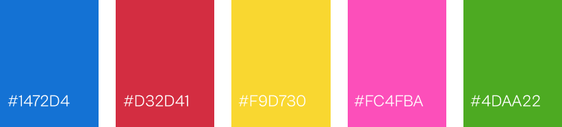
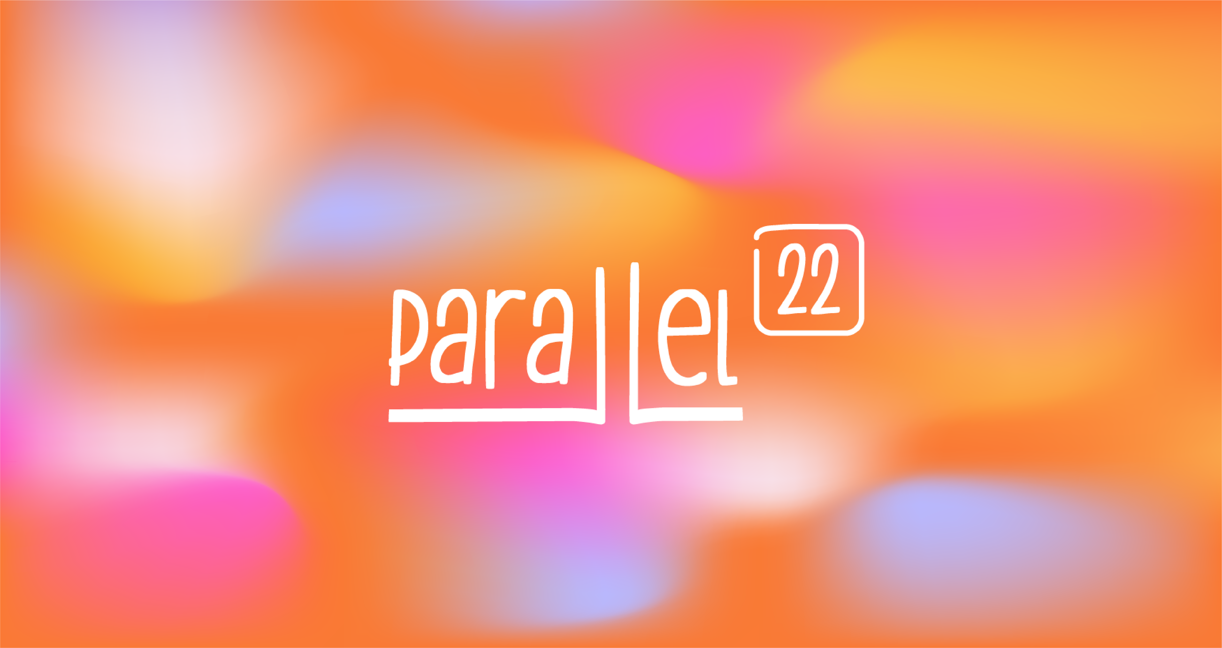
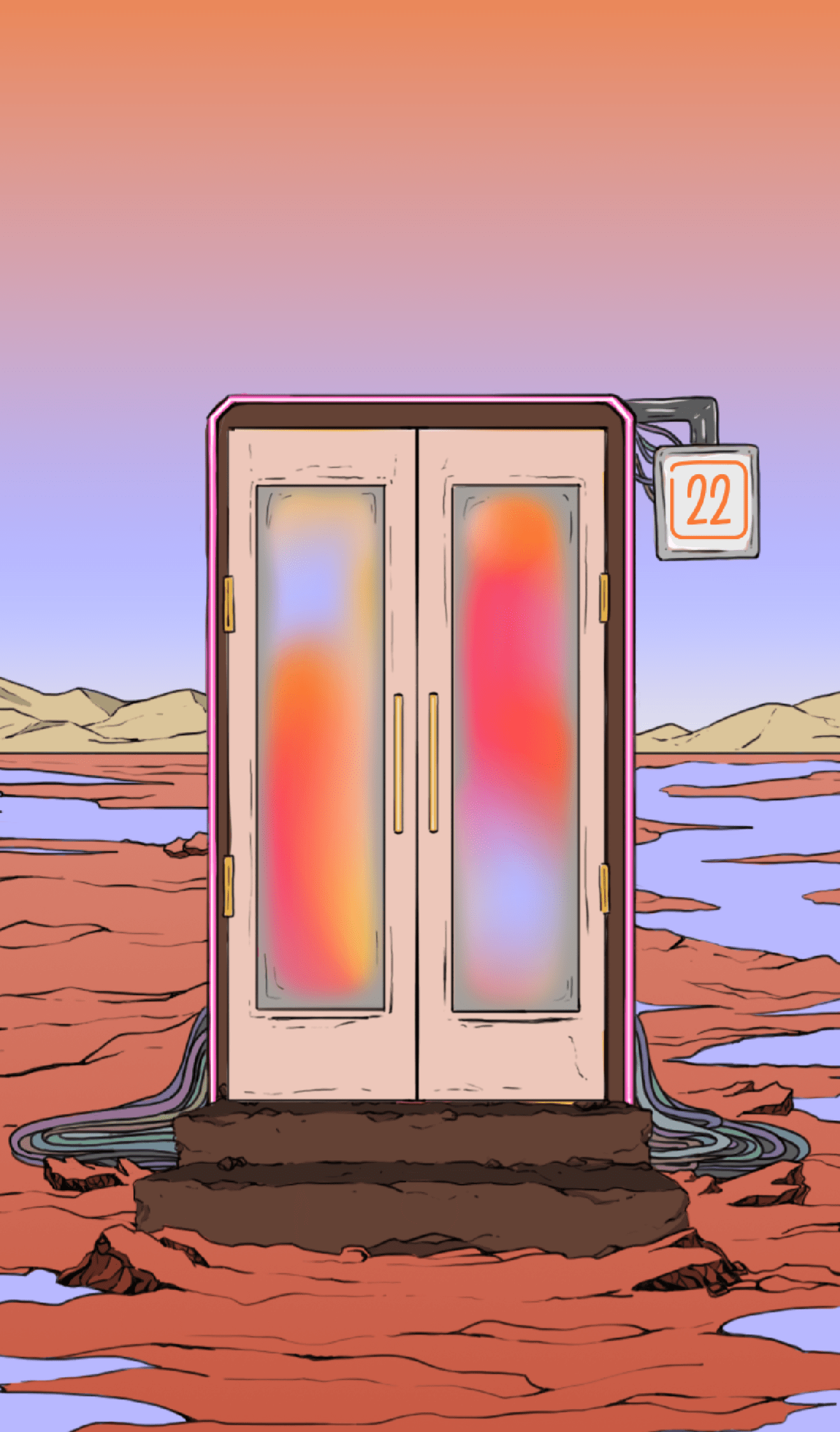
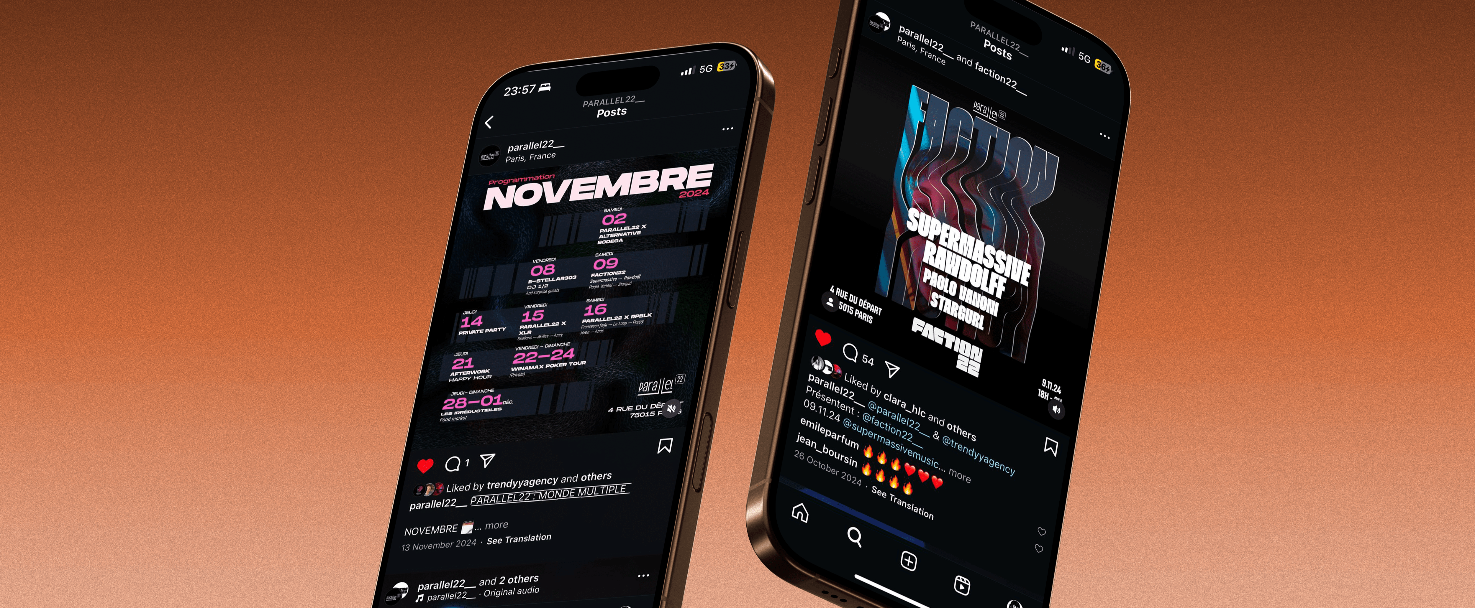
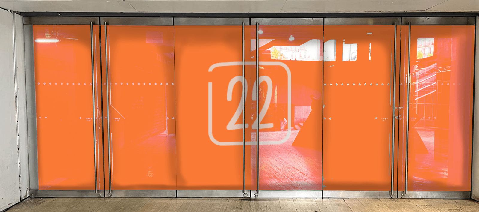
Branding for an ephemeral multi-purpose nightlife spot in Paris Montparnasse, blending the artistic director's vision with a unique identity to stand out in the market.
Visuals inspired by Moebius and Ligne Claire Artists following the artistic director's ambition.
Logomark has extended lines for both letter L, evoking parallel lines, but also the Montparnasse tower, under which the spot is located. The framed 22 is made similar to adress numbers.
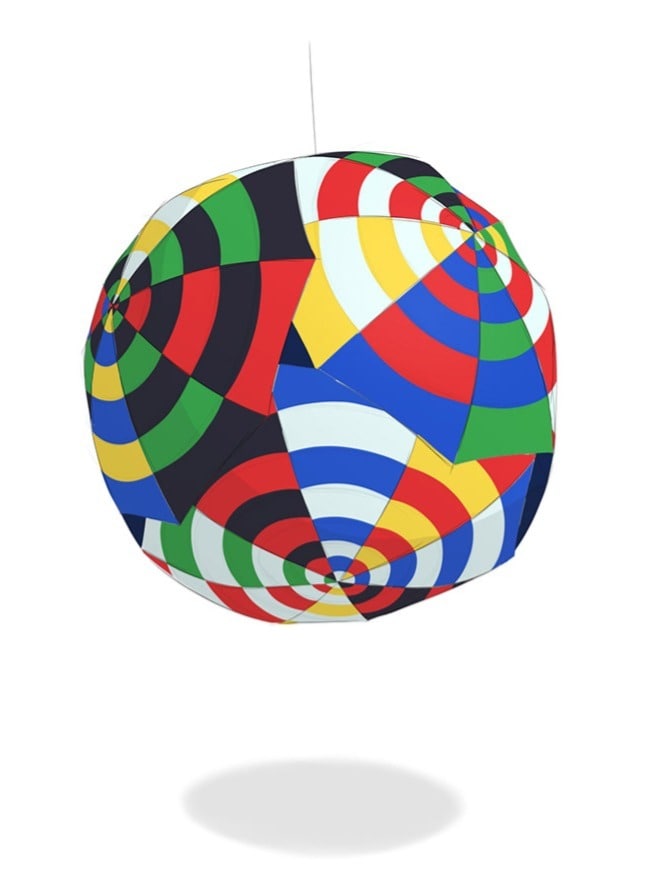
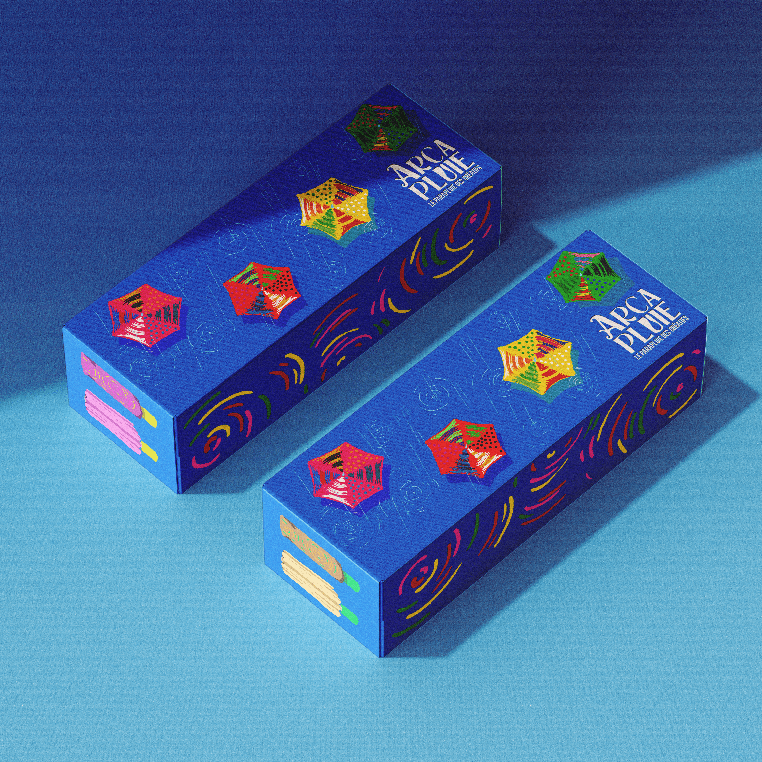
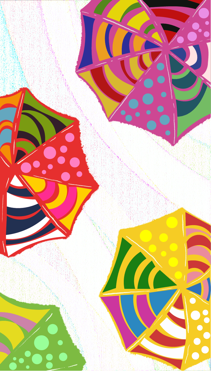
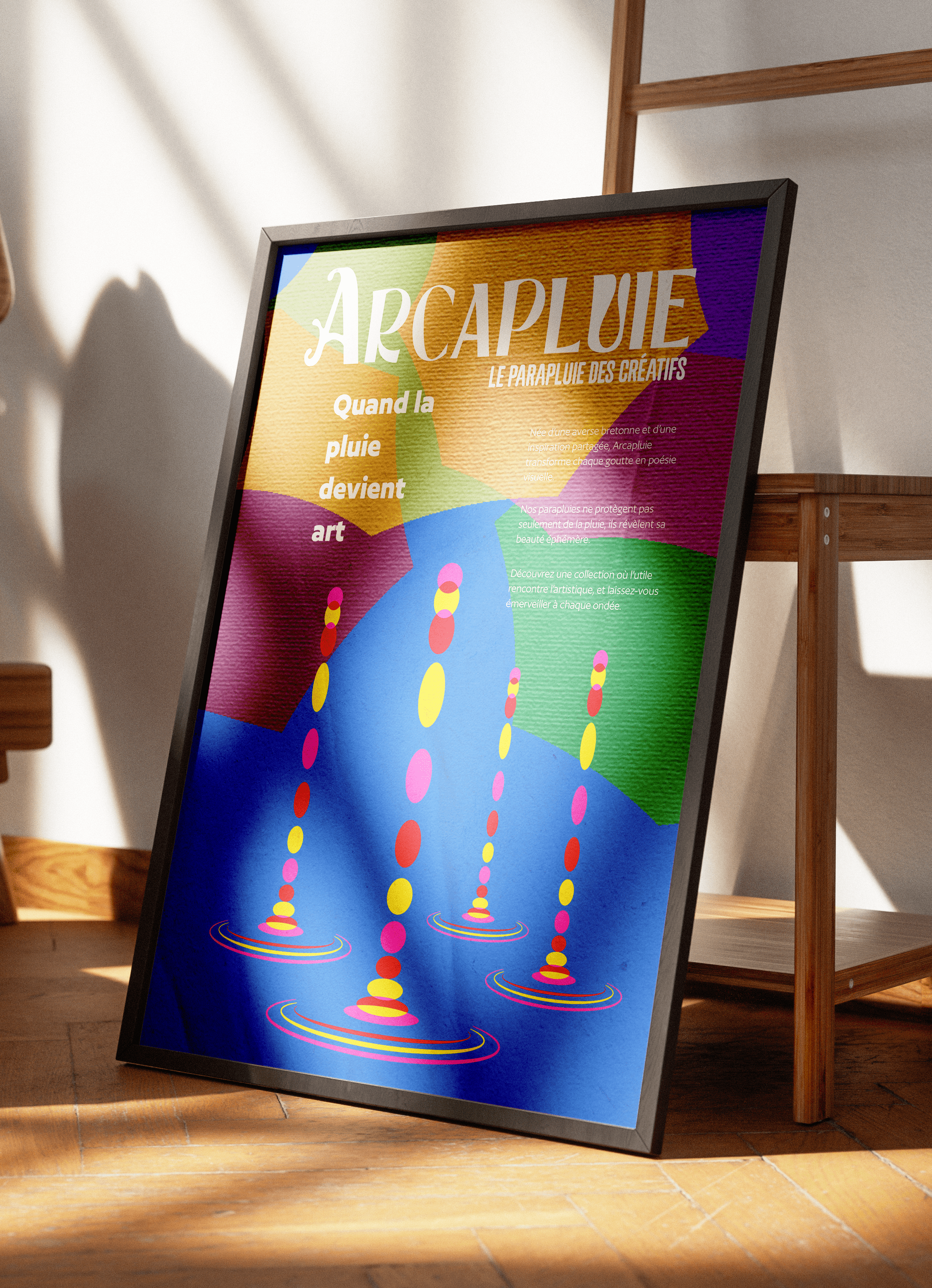
Branding for a fictional brief from the website WeBrief.com, focused on the brand identity of a vibrant and playful umbrella brand.
Visuals are made to be very child-like, showcasing the playful side of the brand and the design of the umbrellas. The different design used also play around types of water disturbances or reactions on a water surface : ripples, droplets, splashes.
The logomark for Arcapluie stays simple : a typography slightly altered to have the shape of an umbrella on the left side of the A, and a water drop inside the letter U.